The Setting
CA Vantage Storage Resource Manager (CA Vantage) reduces costs associated with management of complex enterprise storage environments. It is designed to maximise the use of existing storage resources and ensure protection and high availability of applications and business information. In simple words, it is a piece of software that helps enterprise storage (think: mainframes) admins cruise smoothly through their daily tasks.

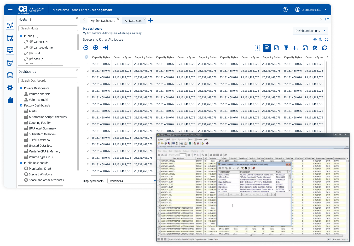
The product itself is a mature solution, a leader in storage resource management. CA Vantage is, essentially, a task that runs on a mainframe, and there exist two interfaces to access it. The first is Windows interface, a standalone Windows application, developed 20+ years ago, and a Web Client, created 5+ years ago.
My Role
As a Designer responsible for the whole CA Vantage, I was working very closely with the product team. I was taking care of a wide range of design areas, including:
- design of product features;
- UX and product research;
- design system application;
- product team design support.
In the same time I acted as a UX Lead for the family of products, called, in SAFe terminology, Agile Release Train. Here I was covering a higher level design governance and planning:
- making sure that teams from my ART have proper support from Mainframe Design organisation;
- preparing Design Runway for the teams in the ART;
- planning Design led initiatives with ART teams.
The Problem
One of the first struggles of my team that I discovered was defining a meaningful feature parity between the two interfaces of CA Vantage. Windows client, even though it was developed more than two decades ago, was praised by users. They loved its feature richness, as well as high customisability, that made work much easier for expert users. Web client of CA Vantage, being initially developed as a POC and with little to no design input, was struggling to catch up with Windows client on a level of functionalities.
Last, but not least problem was the reality of enterprise software sphere, which often provides less opportunities for interaction with customers/users than needed.
The Research
Part 1. Product
I started by learning as much as I can about the sphere and the product as quickly as I can. Constantly consulting with in-house SMEs on mainframes, storage management, and CA Vantage, I was able to get a sense of the problem area and empathise with the user base, at least at basic level.

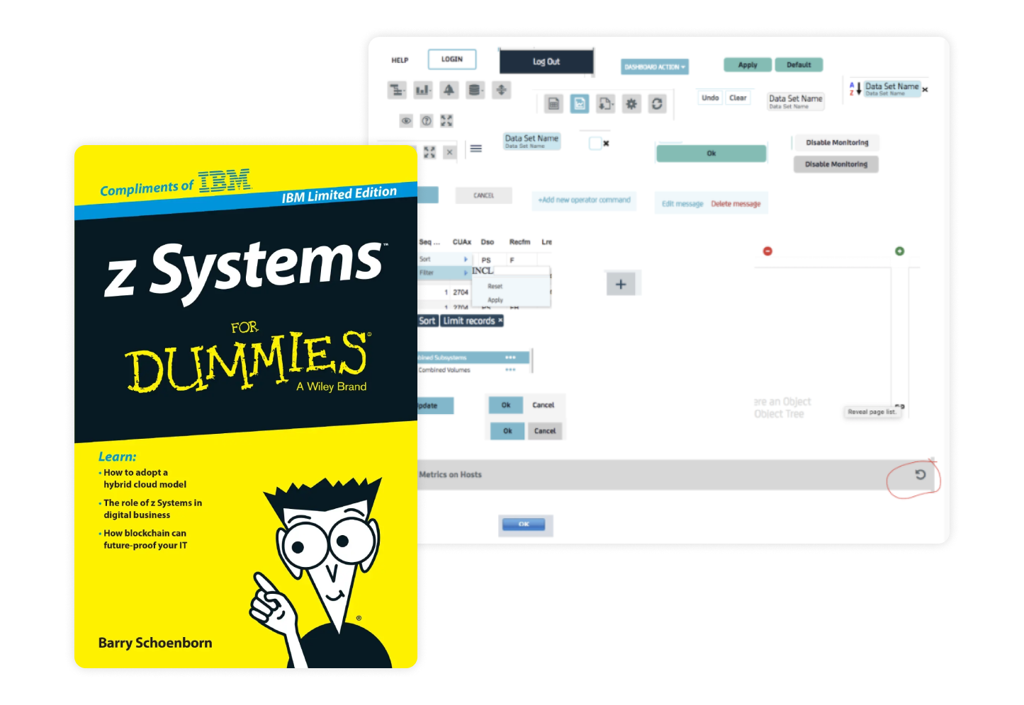
In the same time, while learning the product, I carried out the UI and UX audit, documenting the interface elements and flows inconsistencies, as I tried capabilities of CA Vantage myself.
Part 2. Users and Usability
CA Technologies developed and sold around 100 standalone software products at the time. I found this to be one of the main reasons for very limited access to users and customers that I've faced when working on CA Vantage. Oftentimes, products were sold as bundles to customers, which led to situations where dozens of product teams were trying to contact the very same customer during a span of a week. Needless to say that such scenarios jeopardized customer experience and potential future deals. To control this, design and product management teams created and maintained a certain schedule of customer interactions. These interactions, obviously, happened not as often as a designer would want them to.
When doing my design research and validation, I had utilise any information channel that I could, to be sure that design decisions are made with a certain level of confidence and are backed by real feedback and data. My main sources of information were:
- customer validation portal;
- support tickets;
- Salesforce feedback and community requests;
- meetings with customers;
- gathering feedback from sales and pre-sales;
- customer visits;
- external sprint reviews and demos;
- usability studies and questionnaires.
One of the main successes here was creating a work process with CA Vantage sales and pre-sales representatives. In this process, they served as product team's scouts in the field. Constantly being in touch with customers and leads, they collected information, that they then shared with me and the team weekly. In return, we presented them design prototypes and WIP solutions, getting their valuable early opinion.
Part 3. Findings
On a high level my main research findings were:
- The majority of the users are highly experienced professionals who do not generally care about the interface (platform or UX).
- Their primary concern is the coverage of the functions that the interface can bring.
- Usability is the lowest priority for experienced users, however of course they expect the software to be designed professionally.
- The minority of the users are new not just to CA Vantage but to mainframe in general, they prefer their interaction with the product to be as automated as possible. The number of this user group will grow over time.
This knowledge allowed me not only to create realistic personas for the product, but also to plan feature transfer and transformation to Web client from the older interface.
The Action
Based on all the intel I've acquired from the research activities held, me and the team had to work on prioritisation of the features to be introduced to Web client, so that it reaches meaningful functional parity with Windows client. In practice this meant tackling frequently used basic product features first to enable users reach same level of performance in both interfaces.

Equally important was the task of balancing the experience improvements aimed on entry-level mainframe specialists with powerful features for experienced users. In this effort, which is a classic dilemma for most highly specialised enterprise softwares, I had to carefully learn and at times rethink most critical existing user flows and scenarios. In the result, I was able to split, where it made sense, interactions for inexperienced users and expert users. Workflows and interactions designed for entry-level users were mostly designed around "smart defaults" as well as templates and contextual help, while experience of skilled users offered more customisation and ability to fine tune certain product features.

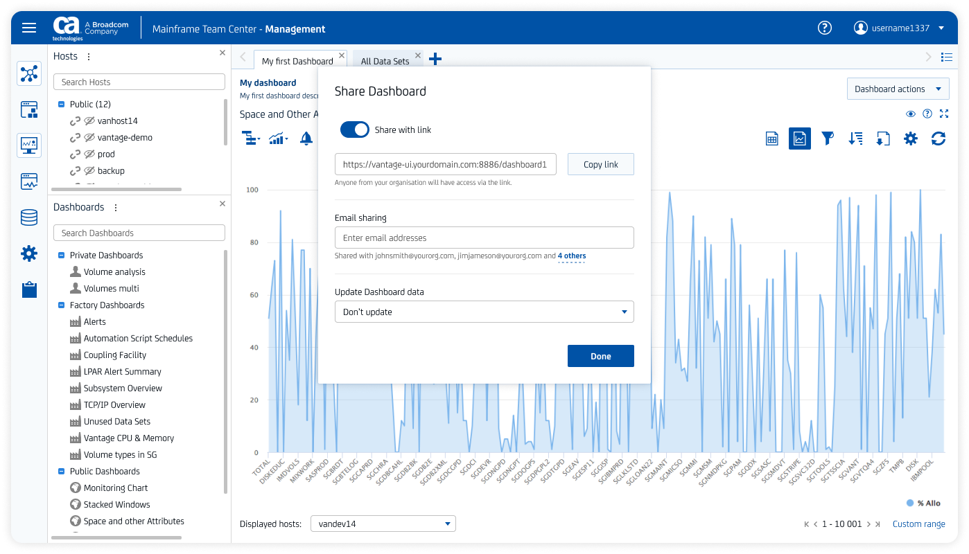
With all the transfer and transformation that took place between the two interfaces of CA Vantage, there was still room for innovation. Me and the team were lucky to have a user base of dedicated mainframe enthusiasts, who were often shared their ideas of improvements of CA Vantage. We used this opportunity to work on certain innovative solutions for the product and for mainframe software in general. A vivid example of such project was extending capabilities of reporting of CA Vantage with dashboard sharing.

What we accomplished
Complex 360 product design work is never an easy task. It requires full immersion into a product's reality, setting up relations and processes with the team, becoming an SME for the product area. On top of that, design work in this type of cooperation is never considered "done", it is a constant process of improvement and refactoring, that spans months and years. However for the time of my work with CA Vantage product team I can highlight a number of successes.
1. Successful transformation of CA Vantage Web client into a substantive product.
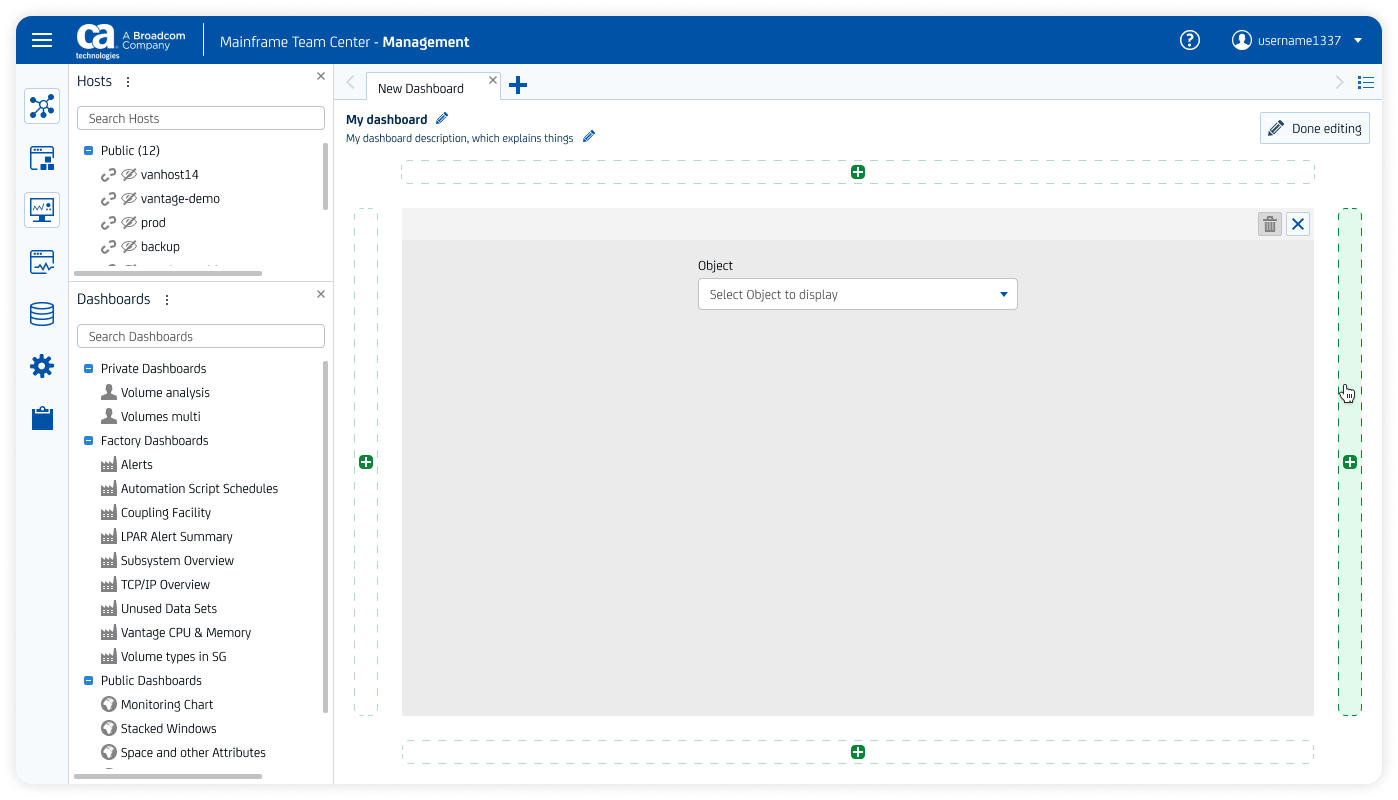
Together with the product team we have developed Web clients into a fully-functioning standalone product, that enables storage administrators to do their job well. We did not simply copy the features from Windows client, but validated the capabilities of certain CA Vantage functions with the users and transformed these capabilities where necessary.
2. Formalising the feedback loop and making it work for the product.
Shortly after joining the team I realised that feedback loop has been functioning in a fairly chaotic mode. I took the task to partner with colleagues from Product Management and introduce structure to the way of how the team gets and processes information from the users. All of the information sources that we were using had their place in the process of product design and development.
3. Creating work processes around cooperation of design and product team.
Together with the product team we have created a workflow and a set of rituals that helped us cooperate effectively. One example is introduction of formal Design Review (review of implemented piece of work by a designer - me in this case) into team's Definition of Done. This worked as follows: whenever the team had to work on something that involved either design or Front-End, all they had to do is to press a button in our task tracking and planning software, and a step in the work item lifecycle called "Design Review" was created. This Design Review had the same weight as Code Review, and was required to be completed for the feature to be considered done. This and other process improvements has earned our team a status of a model team, that was used as an example for other product teams to follow.